What you are saying IS how you are saying it.
“Creative” or “Collateral” is essentially the ‘what’ of your message. The images, descriptive language, font styles, and details should all be ‘saying’ the same thing (or at least speaking the same language). If your brand were a MOOD, what would it be? Make sure everything you put out into the world about your brand is in that mood.

This is where your Brand Guide comes in.
Having a brand guide makes life easier – decisions made at the outset mean less ‘paralysis of choice’ later on. This doesn’t mean you can’t change your mind later, but once you’ve put in this work, any changes you make will come from a place of deep consideration, rather than an emotional response to random conditions.
Do the ‘boring’ step of documenting your brand details now. Literally type up the names of the fonts you use, the color hashes for your theme, a map of what size a “header” is versus a “title” or “paragraph”. If you are working with a professional designer, they will have a much easier time designing for you with these basic details. If you are handling things in-house, having those individual decisions already made is a huge time-saver as you are creating content.
Coloring inside the guides.
While products & promotions you offer may have their own style or theme, they should always look like it’s coming from YOUR business. If your website is rainbows and animated sparkles, your social media posts/advertisements should not be dark and moody. BUT, if a specific product/offer is dark & moody, maybe your normally bright rainbow logo is all shades of grey for this promotion. It’s still from you and your voice, it just has a different tone.
A word about words and word choice.
Your brand is not just about colors and photos. Humans are visual creatures – and you’ll hear a lot about the importance of your logo and your color scheme and I don’t disagree. I do think marketing is a ‘Yes-And” situation where the words are just as important as the colors and pictures.
What is the language style of your brand? Is it monosyllabic? Or do you flex your 800 SAT Language score? Are you appalled by internet abbreviations or do you actually say IRL, IRL? Consistency is key, so once you’ve made your choices, use the same voice on every marketing message you put out, regardless of where you put it (social media, printed flyer, or WhatsApp text message).
Consider this…
With your colors, be sure to note down the HEX (or hash) numbers of all your colors and the RGB numbers (also called HTML/CSS).
With your font choice, first and foremost – is it legible? It doesn’t matter how smart you are or how catchy your writing is if people can’t read it. Test your font in various places and sizes – how does it look BOLD? Is it “Open Source” or generally available? If you find a font you love, but can’t ever use it in your pamphlet designs because the free version of Canva doesn’t have it, consider a different choice.
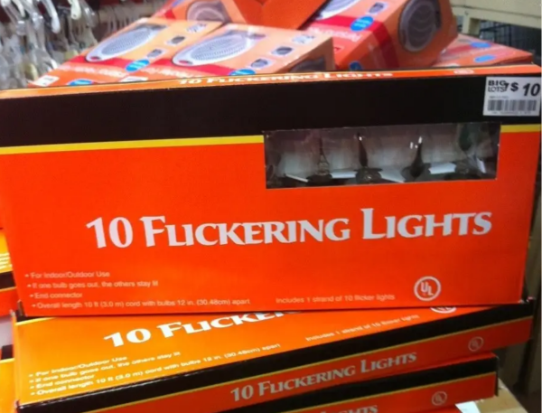
And please, don’t be like this:


Comments are closed